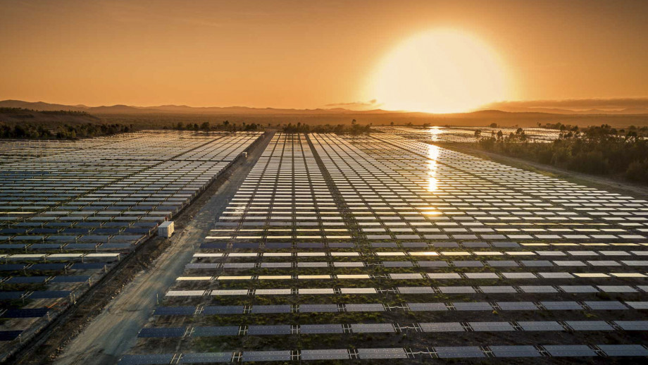
A couple of years ago it might have seemed like converting plots of old-style farmland into new-style solar farms would be a licence for someone to print money. NEM wholesale prices were averaging close to $100/MWh, the market value of Large-scale Generation Certificates (LGCs) under the Federal Renewable Energy Target scheme was around $80-90 (at one certificate per MWh), and the costs of building large scale solar had fallen dramatically, with some projects then reportedly being economic at all-up revenues in the $60-80/MWh range. With potential wholesale revenues of more than double that level, and relatively short lead times for construction, it was no great surprise to see a rush of utility-scale solar projects into the market. Over the last two years almost 3GW of new solar capacity at nearly forty projects has commenced production, with more still in the build or commissioning phase.
It’s instructive to look at the GSD data for many of these recent new entrants, which reveals that – like agricultural farming – solar farming can face multiple headwinds.
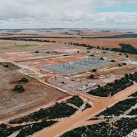
A Case Study – Coleambally Solar Farm
From the GSD pages I’ve picked out the data for a single DUID, Coleambally Solar Farm in southern NSW, for no other reason than it neatly illustrates a number of these headwinds. I could have chosen any of a few dozen other recently commissioned solar farms and shown similar trends.
First, the top of the GSD’s “A Page” for Coleambally gives us some of the basic “demographic” information on this farm and its production history:

We can see that this is a relatively large farm (150MW maximum output capacity) located in the Riverland region of southern NSW, and commenced generating in late 2018.
In the next excerpt, I’ve combined information from the bottom of the “A Page” with the detailed 2019 data on the “B Page” to call out four different headwinds:

Headwind 1 – Falling MLF
Marginal Loss Factors used to be a fairly arcane part of the NEM architecture but have leapt into prominence in the last 18 months or so. Effectively, MLFs adjust the metered energy “sent out” at the point where a generator connects to the transmission grid, to a notional amount “delivered” to a common regional hub or “node”, in order to account for transmission losses. For generators, a lower MLF means larger losses, less energy “delivered to the node” and hence lower NEM spot energy revenues – as well as a smaller number of LGCs that they are credited with creating.
The way in which MLFs are derived is well beyond the scope of this article but suffice it to say that as more generation has been added to more remote parts of the grid, there have been some large swings in MLFs, which are recalculated annually by AEMO.
The GSD data for Coleambally shows that in mid-2019, its MLF fell from 1.002 to 0.869 – cutting its effective quantity of output by over 13% overnight – for both electricity and LGCs.
Headwind 2 – Spot Discount
The first two rows of the Average Price table near the top of the GSD “B Page” compare the time-averaged spot price (Regional Reference Price, or RRP) in the generator’s region, which over any given period has the same value for all generators in that region, with a Volume-Weighted Average (VWA) price calculated by using the generator’s actual output profile to weight spot prices. This VWA price also takes into account the MLF discussed above and any in-house usage by generators, so is effectively the generator’s net spot revenue per unit of production.
Generators with a VWA price significantly greater than the time-averaged RRP receive a revenue premium by targeting their output towards periods of high spot price. Generators with a lower VWA price are those whose output tends to correlate negatively with spot price (and / or those with a low MLF), meaning they experience a unit revenue discount to the spot average.
In the case of Coleambally – and most other solar farms – the highlighted data reveal an emerging trend of discounted VWA prices.

A key reason for this discount in the case of solar farms is the increasing level of available NEM supply during the middle of the day, as well as falling middle-of-day wholesale demand. Both are driven by increased solar generation capacity – on the supply side by newly commissioned large scale solar farms, and on the demand side by growth in “behind the meter” rooftop PV which reduces consumers’ draw from the grid.
All other things being equal these supply and demand changes lead towards lower middle of day wholesale prices when solar farm output is at its highest, hence the VWA price for Coleambally and many other solar farms falling below the relevant regional average from the middle of the year onwards.
We can also compare the price harvest charts at the bottom of the GSD “B Page” for Coleambally with those of a nearby peaking gas generator to get more insight into the drivers of this VWA discount:

Headwind 3 – Constraint Impacts
The whole topic of constraints in the NEM is complex, and the GSD provides at least three different angles for each DUID, illustrated on the earlier excerpt and highlighted as Headwind 3.
The top chart on each “B Page” shows the DUID’s maximum and minimum output range for each day of 2019 (green bars), as well as its physical maximum capacity (straight grey line) and its highest rue availability for each day (black line). For solar farms which generally look to produce the maximum output available given sunlight conditions, this availability line and the top of the daily output range normally coincide. We can see that towards the end of 2019 this wasn’t the case for Coleambally – its actual maximum production was being held below capability by something.

That something was the impact of binding constraints whose hours of impact are tabulated in the bottom of the excerpt – the table shows that there were 2,666 hours (out of 8,760 in the year) where binding constraints might have impacted Coleambally’s output. But clearly for much of the year these binding constraints weren’t causing Coleambally’s output to be capped (note that the fall in availability and hence output in the middle of the year is simply due to weaker sunshine in winter). It’s often the case for binding constraints which include multiple DUIDs and also inter-regional interconnectors that there is no direct impact on generation output – instead there tend restrictions on interconnector flows. The first constraint in the table, contributing to most of the binding hours tabulated, is one of these.

But in November and December 2019, the second binding constraint did regularly affect Coleambally’s output. Another way this shows up is in the third row of the Average Price table, labelled CPD price.

See the GSD glossary for the messy details of this metric (some explanation here), but essentially it reflects the price the generator would need to offer in order to be dispatched at all. Where the CPD price is well below the regional average RRP (ie the large negative values highlighted for these two months) the potential impact of the constraint is more severe.
(But note that the generator still receives the half hourly regional spot price for its actual output – the CPD is just an indicator of constraint severity, which plays out through volumes dispatched, not the price paid to a constrained generator).
Headwind 4 – FCAS costs
Finally, if the first three headwinds weren’t enough, the GSD data for FCAS Costs reveals that a significant fraction of the plant’s spot revenue would have been consumed by charges levied for the recovery of market Frequency Control Ancillary Services (FCAS) expenses. In the case of Coleambally, these were equivalent to over 7% of spot energy revenues:

As highlighted, the bulk of these charges were for recovery of Regulation FCAS. The typical incidence of Regulation FCAS recovery costs for most generators is significantly smaller than this at only a few percent. The data in the GSD show many solar farms incurring recovery charges in the 5-10% range. Allocation of Regulation FCAS charges is very involved (the Guide to Statistics at the end of the GSD gives some information), but for generators it tends to fall disproportionately on those whose output in each Dispatch Interval varies more from its target or forecast values. The GSD provides a table of this “Raw Off-Target” distribution for each DUID

For Coleambally, and most other solar farms, a significant proportion of hours (more than for non-solar generators) show output levels materially away from forecast values (noting that this tabulation includes night-time hours when output is always zero). This probably reflects the difficulty for real time solar output forecasting systems in capturing effects such as intermittent cloud cover and the fast ramping of output up and down during early morning and evening periods. But its impact, as shown in the GSD, is to significantly increase the FCAS costs borne by utility solar farms.
In Summary – Who’d be a solar farmer?
My point in drawing attention to these various headwinds – all of which require grappling with some of the finer details of the NEM’s operation – isn’t to run down solar farms, but to illustrate, using the detailed data brought together in the GSD, that the NEM is a market where details matter.
I doubt that many, if any, of these headwinds were top of mind for investors and offtakers in the rush to get solar projects up and running in the days of three digit spot prices and $80 LGCs. But collectively the impact of all these factors on a single project could account for a very significant share of someone’s projected profit margin (remembering that we don’t know who bears the various risks and costs allocated around under Power Purchase Agreements and other contracts supporting the construction and operation of these generators).
I’m sure the next wave of solar farmers will go in with their eyes open much wider.
The views and opinions expressed in this article are the author’s own, and do not necessarily reflect those held by pv magazine.
This content is protected by copyright and may not be reused. If you want to cooperate with us and would like to reuse some of our content, please contact: editors@pv-magazine.com.


By submitting this form you agree to pv magazine using your data for the purposes of publishing your comment.
Your personal data will only be disclosed or otherwise transmitted to third parties for the purposes of spam filtering or if this is necessary for technical maintenance of the website. Any other transfer to third parties will not take place unless this is justified on the basis of applicable data protection regulations or if pv magazine is legally obliged to do so.
You may revoke this consent at any time with effect for the future, in which case your personal data will be deleted immediately. Otherwise, your data will be deleted if pv magazine has processed your request or the purpose of data storage is fulfilled.
Further information on data privacy can be found in our Data Protection Policy.