For our purpose as market analysts we say that curtailment in the National Electricity Market (NEM) typically happens due to one of two factors: either due to network reasons or due to economic reasons.
I will elaborate on those two types of curtailment further down, but to avoid repeating what’s already been written on WattClarity, I will point out two great articles that explain this concept in more depth, and which also provide some more detail about the calculation methodology we’ve employed – this one by Allan O’Neil and and this one by Marcelle Gannon.
In this analysis we are looking at curtailment specifically for semi-scheduled solar and wind farms. As a quick reminder, the semi-scheduled category is a registration category that generally covers all solar and wind farms in the NEM greater than 30 MW, although there are some exceptions. In this article, everything mentioned here relates to semi-scheduled solar and wind units only. There is generally no availability data in the public domain for non-scheduled and behind-the-meter solar and wind farms – so therefore we can’t analyse curtailment figures for those.
The bigger picture view of curtailment
In our GSD we publish curtailment figures for each individual semi-scheduled solar and wind unit. But by using the GSD data extract, and with a tiny bit of spreadsheet work, I have been able to aggregate all of these numbers together to gain a higher-level overview of curtailment across the NEM.
In Part 1, I posted a chart showing the combined view of production and curtailment for these solar and wind farms. For reference, that chart is shown again below:
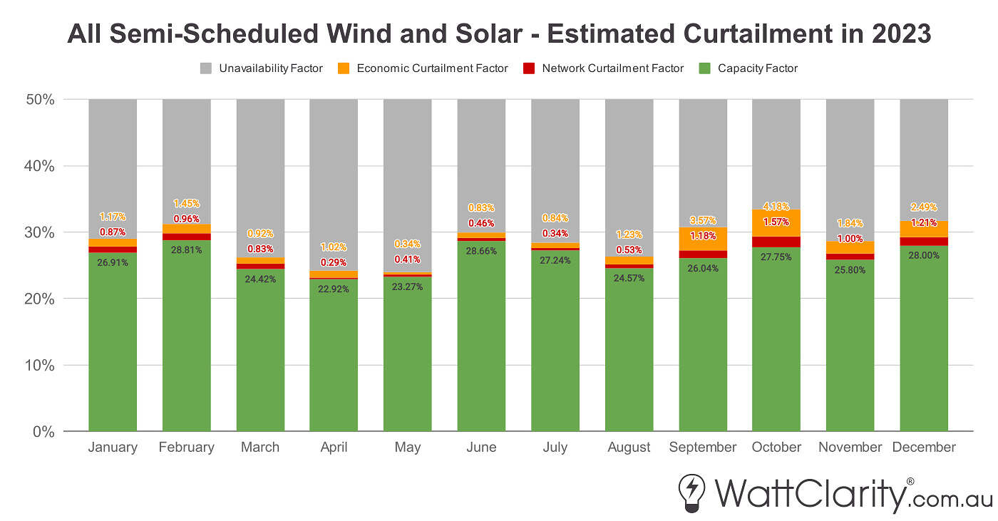
Source: GSD2023 Data Extract
In green, you can see the volume-weighted capacity factor for all solar and wind. So in the chart we can see that combined generation was therefore lowest in April and May in 2023, owing to less favourable solar and wind conditions.
In red is the network curtailment factor – that’s a metric that I believe we’ve coined. It’s a very similar metric to capacity factor, but instead of volume of energy generated being the numerator, it uses the volume of energy curtailed due to network constraints as the numerator. Expressing this as a factor is a useful way of showing relative curtailment at a unit level, or, at an aggregated level like shown here.
And finally in orange, you can see the economic curtailment factor – which again, is a similar metric we’ve created, but the numerator being volume of energy economically curtailed.
Note: As Allan has kindly pointed out in the comments below, it is important to note that the denominator in all of these factors is aggregate maximum capacity (in MWh). This differs to other metrics of curtailment from other sources that tend to use available energy as the denominator.
In the next chart below, I’ve separated the data, and am now just showing these factors just for the wind component.
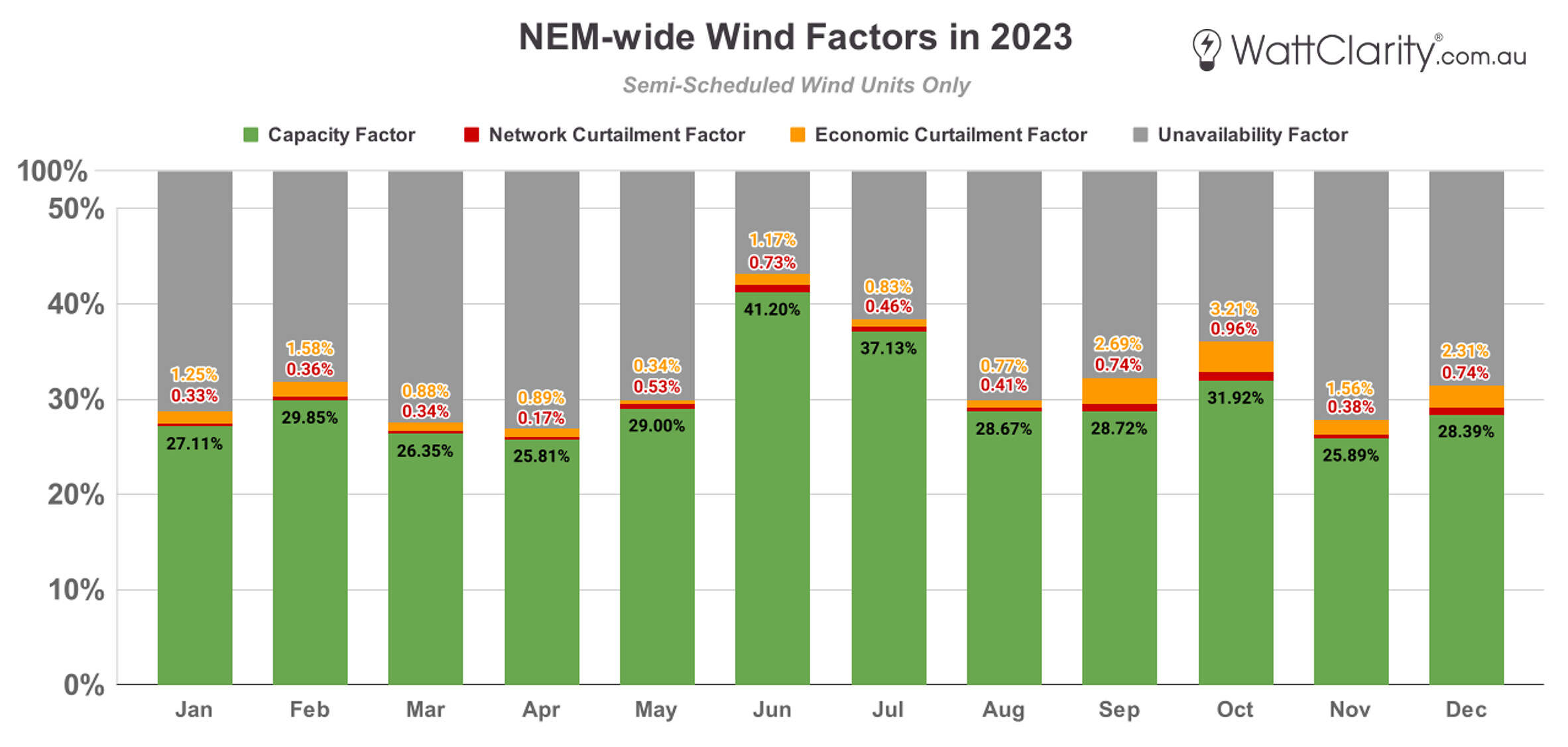
Source: GSD2023 Data Extract
Here, we can see relatively less network curtailment across the year compared to the last chart. Although wind generation was highest in winter (where the volume-weighted capacity factor even went above 40% in June), we can see that there was a proportionally small amount of curtailment of either kind during these months.
We also see that there was a more material amount of economic curtailment in the back four months where economic curtailment ranged between 1.56% to 3.21% relative to total capacity between September to December.
Given that we’ve recently come off of a widespread wind lull, it will be interesting to see this year’s numbers when we run our calculations again for the GSD2024 early next year.
The next chart displays those factors but now for only solar farms.
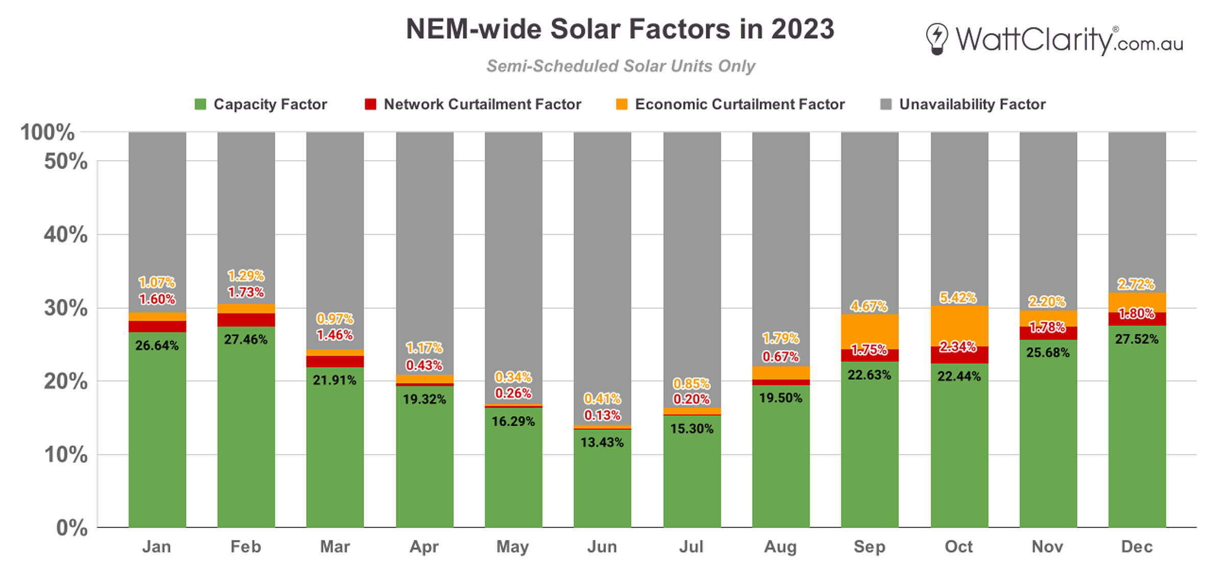
Source: GSD2023 Data Extract
We can see the obvious seasonal shape of production through the year – with solar capacity factors dipping in those winter months with less daylight. There was also lower curtailment of either kind in those months.
Here curtailment again peaked in the back four months of the year. In October alone we see that there was a combined total of 7.76% of curtailment, compared to a 22.44% capacity factor. So that means that there was a ratio of roughly 3:1 in terms of energy actually produced compared to what was lost to curtailment for that month.
Network Curtailment
Network curtailment occurs when a network constraint limits a unit’s output to levels lower than what was available to generate. For that reason, others have referred to this as ‘forced curtailment’ because it is imposed on the unit operator. Network constraints are a very tricky area of the market – one that we like to cover regularly on WattClarity, and that we attempt to help our clients navigate in real-time through our ez2view software.
In the image below I’ve mapped individual network curtailment factors for each solar and wind unit across the NEM. The size of the icons on the map are scaled to their network curtailment factor. The transmission network is grey scaled with higher voltage capacity shown as darker lines.
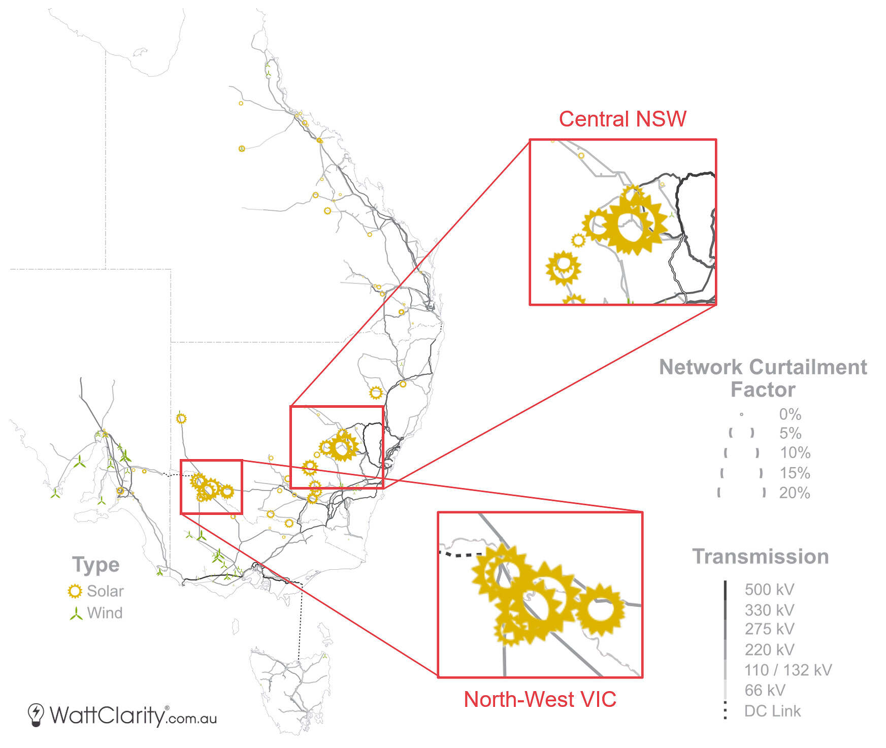
Network curtailment factors across the NEM in 2023. Whilst network curtailment was evident throughout the NEM, these two sub-sections of NSW and VIC were the worst hit areas.
Source: GSD2023 Data Extract
We can see that across the network, there was a measurable, albeit small, amount of network curtailment occurring in all regions, except perhaps Tasmania. But by far, there are two smaller sections of the network that were worst hit, and are highlighted in the map above:
- A section of central New South Wales on the 132 kV line just west of Orange,
- And the 220 kV section of North-West Victoria, at the top of the so called ‘Rhombus of Regret’.
The top five ‘worst hit’ units were all solar farms, and were all located in these two sections. I covered some of those outcomes in Part 1, and regular WattClarity readers would have seen a couple of those solar farm appear at the top of that list in previous years also.
Network curtailment was very material in those most extreme cases – we see at Molong Solar Farm that there were more MWhs of energy being network curtailed than there were MWhs of energy being produced last year.
Economic curtailment
Economic curtailment is also referred to as ‘self-curtailment’ or ‘offloading’ as it’s a deliberate choice made by a generator to operate below their available generation at certain times – generally because the resulting spot price was below what they were willing to generate at (see: increasing negative prices). You can think of this as a measure of how many MWhs were ‘priced out of the market’ because the price offered for those volumes was higher or at the spot price.
There is some nuance that is important to understand about economic curtailment. Units submit bids before the dispatch process runs. And ultimately, it is the dispatch process that determines constraint outcomes, and therefore network curtailment. The effect of this is that there will be some economic curtailment which might be hiding what would have otherwise been network curtailed, but not vice versa. As we can’t re-run the dispatch process for every interval with different bids, it’s therefore extremely difficult to say with certainty how much of this economic curtailment would have otherwise been network curtailed.
On the map below we can see that economic curtailment was far more evenly spread across the NEM than what we saw in the previous map.
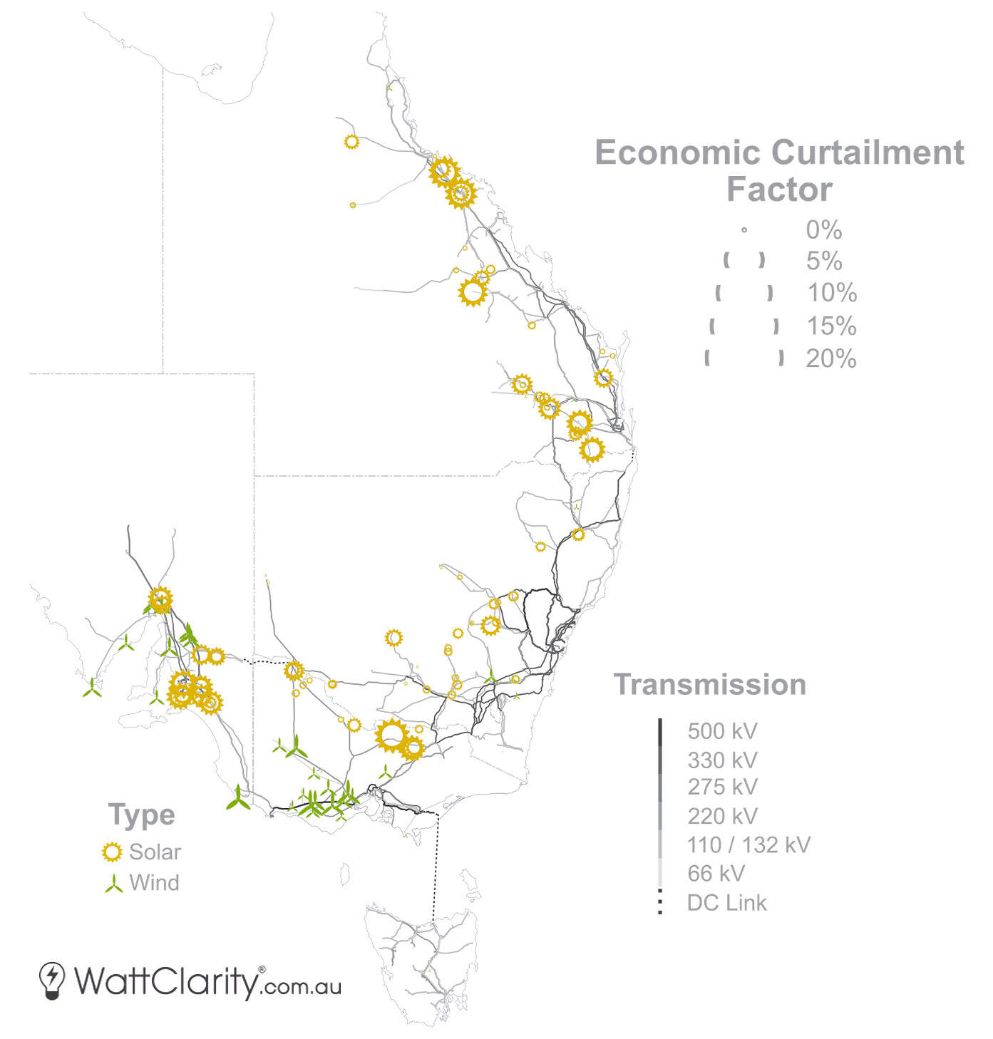
Economic curtailment in 2023 was far more evenly spread out across the four mainland regions.
Source: GSD2023 Data Extract
We see solar in Queensland was hit particularly hard, and slightly less so in New South Wales. There was relatively little economic curtailment for wind farms in those two regions. In Victoria and South Australia, we see that there was material economic curtailment for both solar and wind.
The top five worst hit units in terms of economic curtailment were also solar farms, some of these were mentioned in Part 1. Using our ez2view software we can see that the bids for some of these solar farms have remained very static despite the curtailment – so we assume that long-term contract terms are dictating the pricing of some of the bids there.
Key takeaways
I hope these charts and maps have shed a bit more light on what is happening with curtailment across the NEM. To conclude, below are two key points that I’d like to share based on this analysis.
- Solar farms continue to face economic and network challenges. We observe a seasonal amplification of these challenges. Curtailment for wind generation last year was slightly less severe, and largely confined to economic offloading in Victoria and South Australian throughout Spring.
- Curtailment is a function of supply and demand (and the network). It’s important to understand that both network congestion and bid stack congestion relate to how supply and demand meet. We therefore need to consider the amount, profile and location of available generation against the amount, profile and location of demand (and the network in between). Or in other words, the value of the underlying electricity.
Author: Dan Lee, energy market analyst, Global-Roam
The views and opinions expressed in this article are the author’s own, and do not necessarily reflect those held by pv magazine.
This content is protected by copyright and may not be reused. If you want to cooperate with us and would like to reuse some of our content, please contact: editors@pv-magazine.com.


Amazing!