From Watt Clarity
As I’ve done on rare occasions in the past (noted here in 2018, for instance) I thought it might be a learning for me to invest a bit more time in diving into the numbers in order to learn more from this microscopic example that might pertain to the broader energy transition.
(A) A few key dates
Before getting into some data, readers might like to keep in mind some key dates with respect to our own journey at home:
| Key Date | Quick Notes |
|---|---|
| Earlier |
We lived in an old Queenslander that suffered from poor energy efficiency. |
| late 2012 and 2013 |
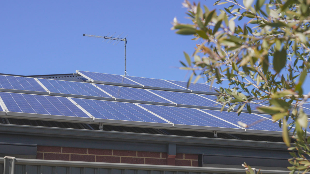
Late 2012 we moved out for a period of a bit less than a year in order to allow for a major renovation of our home. A small part of this renovation included the installation of a 5kW rooftop solar system prior to the cut-off of the 44c Feed-in-Tariff legislated by the Queensland Government. We did not shop around much in choosing a retailer at the time, so went with one of the big brands (we chose AGL Energy – but that’s not really relevant for the purpose of this article). |
| 2017 |
In 2017 we upgraded our monitoring of what was happening with our own electricity usage and production at home, with the addition of the Solar Analytics monitoring gadget, and we’re grateful we did. Soon after we’d done this I wrote about ‘some initial musings about my own rooftop solar learning exercise’. |
| 2020, 2021, 2022 | Like most of the country, with the advent of the first waves of COVID-19 our company shifted to ‘work from home’ operations (and our kids shifted to remote learning as well) from around March 2020.This continued through 2021 and 2022 to some extent – from 2023 my working-from-home has reduced to a low amount.
All of this contributed to higher electricity consumption at home through 2020, 2021 and 2022 than what would have otherwise been the case. |
| 2020, 2021, 2022 | Overlapping with the above, this period also saw the advent of La Nina dominant weather patterns – complete with lower solar production. |
| 2022 | Of course also in 2022 we all lived through the ‘2022 Energy Crisis’ that culminated in the suspension of the market on Wednesday 15th June 2022. |
With the above in mind, you might find the following of some interest (a subset of readers might be able to help me out with answers to the questions I have asked!)
(B) Usage, and Production, over time
One of the things that prompted us to invest time this weekend in putting this analysis together was the fact that:
1) We’ve watched the cash refunds from our chosen retailer reduce steadily over the past couple years;
2) This has happened to the point where we even had to make a small payment* of a bill in the most recent round.
* I know, we’re one of the fortunate ones who’ve not had to do this for a little over a decade, but it still was a bit of a shock.
Knowing that this particular home utility service would be of interest to us over time we’ve retained copies of every electricity statement we’ve received since 2012 – hence over the weekend part of time time invested came in reconstructing this trend of daily average net consumption at home, and daily average net export from our rooftop PV system:

In this chart, and others below, we’ve used time on the x-axis but have placed the data at the end of each billing period. The cadence of the data is a little odd, though … for two main reasons:
1) In the past 6 months our retailer has upped their billing frequency to monthly, for reasons we’ve not yet explored.
2) Prior to that time the billing frequency was consistently on a quarterly basis – however you’ll sometimes see more than 4 dots in a given year, and that’s because I’ve broken apart any bill that contained any change in the charging component … either:
(a) Electricity usage charges (discussed below); or
(b) Retailer add-on to the 44c Government-mandated FIT …
i. which in our case is now down to zero …
ii. little wonder that it’s now zero, given the rise-and-rise of negative prices in the QLD region (this report to the end of 2020) …
iii. driven by the popularity of solar PV in QLD (with wind a much lesser share here) and the continued presence of thermal generation for the ‘keeping the lights on services’ they all still provide.
The two series shown are:
1) the average daily net exports from the solar system (i.e. at times when the solar system is exporting); and
2) the average daily import from the grid (i.e. at times when the solar system was not exporting).
3) hence be aware that there’s essentially a third data series that’s unable to be shown here and that is the ‘missing’ amount of rooftop PV production that’s not exported because it’s been consumed onsite through each day.
With respect to the trend above, many observations can be made – but I thought it particularly useful to highlight the following:
Key Observation #1) Data understandability
It’s understandable why the two different data sets published on the bill are chosen that way … after all, they are the ones that are used to determine our bill (or payment) each quarter/month.
(a) The Feed-in-Tariff is a net feed in tariff; and
(b) We only pay for imports from the grid, not exports … at least in volumetric terms (though the move to increasing daily charge, noted below, is partly intended to address that).
However that does not mean that they are the data sets I’d ideally like to have for this form of analysis.
What would be better than the two data sets above would be also having the ‘missing’ 3rd data series (i.e. the solar production that’s self-consumed onsite each day) as this would better enable me to answer the other questions I have about how our house is performing. Given we don’t have that, we’ll just have to do the best we can – whilst remembering some data is unfortunately missing.
Key Observation #2) The value of energy efficiency
Having lived the ‘before’ and ‘after’ performance of our home my family clearly knows that they’d rather be living in a ‘post renovation’ world.
Leaving all the other reasons to one side for a moment, the value of a more energy-efficient design of home can be clearly seen in the daily average net consumption before and afterwards:
(a) Post renovation the red line is net energy consumption:
i. So also shows the invisible effect of production from solar consumed internally;
ii. But at least some of the difference is due to better energy efficiency (LED lights, better insulation, better use of passive heating and cooling and so on).
(b) Coincidentally, last week the Energy Efficiency Council released its flagship report ‘Clean Energy, Clean Demand’ which I have not read, but presume includes a major focus on energy efficiency.
Key Observation #3) Appropriate sizing for a rooftop solar system?
This observation is really more of a question than an observation… in our case the average daily net export from the rooftop system consistently exceeds our daily net import from the grid.
In a ‘if-you-say-if-fast-it’s-misleadingly-simple’ kind of way, we could net the two off and see that in net terms we’re contributing a benefit to the grid.
(a) Part of this thinking revolves around the mindset that ‘the grid’ is some relatively infinite pool in which we can bank surplus to draw down on later as our solar declines and night-time demand rises … in our case leaving the surplus amount in the grid for collective benefit.
(b) But as readers here will know we’ve said before ‘the NEM is a complex place’ and the reality is much more nuanced than that.
Seeing the two series side-by-side like that does make me wonder what type of target we should be aiming for, in daily average terms, in terms of net injections or withdrawals from the grid?
(a) What sort of advice are residential energy users receiving these days when they are exploring how much solar to install?
(b) Is it based on ‘install how much you have roof space for, and can afford’, or some other criteria?
Key Observation #4) Net exports from solar has been depressed for several years
The last billing period that’s seen daily average solar exports approaching 20kWh per day was the ~90-day period ending 29th November 2019.
In the more than 3 years since that time, it’s clear to see that net solar exports have been considerably lower (especially so in the ~90 day period ending 2nd June 2022). There are a couple reasons for this, including the following:
Reason #1 = the rise of COVID drove increased time at home (for work and school), which contributed to higher electricity consumption during the day, and so lower net exports
… readers might recall this series of analytical articles written during the period about how COVID might have shifted the location of, and otherwise affected, electricity demand.
Reason #2 = this coincided with the three-years of consecutive La Nina weather pattern that delivered cooler & wetter periods that depressed rooftop solar production and contributed to higher electricity load for lighting and (in the cooler months) heating.
… one of our readers has pointed out Solar Analytics wrote about ‘How La Nina impacts your rooftop solar!’ on 27th Jan 2023.
Possible Reason #3 = there’s a 3rd factor possibly contributing (which is part of the reason why we started this analysis over the weekend) being concerns that the performance of our solar system has degraded compared with when it was installed a little over 10 years ago now.
(a) Through the analysis included in this article we’re trying to ascertain the extent to which this has actually occurred (if at all);
(b) Perhaps some of our more learned readers who work in this area can help us out?
Key Observation #5) Electricity consumption is up (particularly in winter)
Looking back over ~10 years it’s apparent that our highest electricity draw from the grid* has occurred in winter periods.
* readers should keep in mind that ‘draw from the grid’ is not the same as gross consumption, which is invisible in this analysis given the amount of solar locally generated that’s been consumed onsite. Whether that share is higher in winter or not is unable to be ascertained here … it certainly would have been different in the 2020-2022 period compared to the years beforehand.
Across the winter periods, there’s been a fair degree of difference … but there’s a clear growth in daily average net ‘draw from the grid’ from winter 2019 to winter 2020 to winter 2021, and especially to winter 2022. Winter 2022 stands out in memory because it was colder earlier, and the period leading into it was also cloudy and wet.
Key Observation #6) Illustrating factors in the ‘2022 Energy Crisis’
Readers here will recall the many articles written as the whole of the NEM progressed through the ‘2022 Energy Crisis’.
In the trended consumption and production chart above we see a micro-example of what was the case more broadly in terms of some of the triggers for the event:
(a) In the ~90 day period to the 2nd June 2022 we see the daily average net export from rooftop PV being the lowest experienced since the panels were installed (excluding a period in 2015 where the panels were removed for a number of weeks whilst the roof was being replaced after the hail storm of 2014).
In this analysis published in September 2022 we’d concluded that aggregate solar production across QLD and NSW was disappointingly low through Q2 2022, so it’s not a surprise to see such a conclusion mirrored in our own household data.
(b) In the 14 day period to 16th June 2022 we see daily average consumption outside of solar hours spike above 20kWh per day.
i. My recollection is that this was due to the early onset of cold weather;
ii. Which I’ve confirmed by spot checking these days in the Solar Analytics data.
(B1) Has the performance of our solar system degraded over time?
Being more focused on the wholesale end of the market I’ve heard discussion about degradation of solar PV performance over time (large scale and small) but have not really focused too much on it … however even before we’d put the above trend together I had started wondering whether our solar system had begun degrading in performance.
There are several reasons for this concern:
1) Hearing about such degradation before means I am aware that it can happen (though I’ve not really invested time to look into the circumstances);
2) Even with the knowledge that the above green line shows daily average net exports to the grid (i.e. I am aware that it’s not gross production) the tendency is to look at the trended line above and see the drop from the end of 2019 onwards and be suspicious about causes.
3) In the sporadic use we’ve made of Solar Analytics data since 2017, and PV output data beforehand, I’ve got this nagging thought that the output used to be higher at times.
So with the above in mind we’ve chosen to look at November months (in part because it appears in the longer-term trend that the 3-month billing period ending 29th November 2019 was the last period showing average production approaching 20kWh per day) and work backwards…
November 2022 – Solar production shape
Here’s a ‘sunny day’ profile during that month – being 26th November 2022:

Note that the peak production is may not even reach 3.5kW for a 5kW installed system.
… acknowledging that my memory is not infallible, but I still have a strong feeling that I’d seen times in the past where the peak production of our solar system was in excess of 4kW on similar ‘sunny day’ scenarios at summertime:
(a) I’m a bit hazy on whether it ever actually reached 5kW, but would swear that it was regularly above 4kW in the ‘early days’.
(b) I also note that 26th November 2022 was not actually during peak summer … so (remembering what Dan wrote about latitude here, but also conscious of high temperatures impacting peak performance) I wonder when ‘peak’ solar output would be expected to occur in Brisbane?
Here’s the rolled up daily kWh production profiles across a span of time around November of that year:

In this date range we see that 2nd November 2022 (selected) shows 30.7KWh for the day, which appears to be somewhat higher than that shown for 26th November 2022. Let’s compare this with previous November periods…
November 2021 – Solar production shape
Here’s a ‘sunny day’ profile for 13th November 2021:

Eyeballing this compared to the profile for 26th November 2021, we see that this shape does get much closer to 4kW peak output around the middle of the day …
(a) so higher than shown above for 26th November 2022
(b) … but there might be different reasons why this was the case.
Here’s a trend of daily aggregates containing November 2021 – highlighting the daily production of 30.8kWh on the same day as the above:

… but note in the same trend for November 2022 that the 2nd November 2022 produced 30.7kWh.
November 2020 – Solar production shape
In this year, the 26th November 2020 was a ‘sunny day’ scenario:

Again this day looks to have somewhat higher yield shape than shown for 26th November 2022. Here’s the rolled up daily kWh production profiles across a span of time around November of that year:

The highlighted day (6th Nov 2020) shows 29.6kWh gross production.
November 2019 – Solar production shape
In this year, the 12 November 2019 was a ‘sunny day’ scenario:

Here’s the rolled up daily kWh production profiles across a span of time around November of that year:

This trend has 5th November 2019 highlighted (at 29.1kWh).
November 2018 – Solar production shape
In this year, the 26 November 2018 was a ‘sunny day’ scenario:

Here’s the rolled up daily kWh production profiles across a span of time around November of that year:

The highlighted day (of 23rd Nov 2018) is three days earlier than the half-hourly profile shape above and yielded 31.1kWh.
November 2017 – Solar production shape
In this year, the 4th November 2017 was a ‘sunny day’ scenario:

Here’s the rolled up daily kWh production profiles across a span of time around November of that year:

The same day (4th Nov 2017) is highlighted, and saw 28.5kWh produced in gross terms.
Prior to 2017
As noted above, it was in 2017 that we deployed the Solar Analytics monitoring system, so we don’t have the same level of visibility before that.
We were using the freely accessible ‘PV output’ system prior to that time to occasionally check what was happening to our system. I had a quick look over the weekend but can’t find records in PV output to match my vague recollection that we’d seen peak output well past 4kW in the early period of the use of the solar system.
Seeing (in the longer trend above from bill data) that we’d averaged 20kWh net exports per day in the 65-day period to 4th November 2013 (i.e. just in spring) makes me wonder, though…
Walking through the sample of available data over 6 years of available history, there does not appear to be a clearly discernable drop in gross output for our solar system – at least from 2017 to 2022. If there was degradation, is it possible that it would manifest in different ways, or have been seen earlier? Perhaps one of our more learned readers could help me understand more?
(B2) Where to get the ‘best’ electricity deal for us?
Part of my task over the weekend was to ‘shop around’ for a better electricity retail offering … which for us means possibly:
1) trading off the rates offered by retailers for any net draw from the grid
2) against any adder on top of the 44c legislated FIT (at least out till scheme conclusion in 2028).
Thankfully I now have 10 years of net consumption and net production history that will make it easier to get a more accurate comparison.
B2a) Background information
I thought it might be useful to summarise the background information I’ve come across in this process, which remains ongoing:
1) The Queensland Competition Authority monitors solar feed-in tariffs in SEQ, as directed by the Minister responsible for energy. In March 2013 (i.e. ~ 10 years ago) they published the report ‘Estimating a Fair and Reasonable Solar Feed-in Tariff for Queensland ’ that might be useful. In a quick skim I found these two points under the 9 x ‘Key Findings of particular interest to me:
Key Finding 3/9 = There is no compelling evidence to support a regulated, mandatory minimum feed-in tariff for customers in the South East Queensland retail electricity market.
Key Finding 9/9 = Government could consider moving PV customers to Tariff 12 which would expose them to a more cost-reflective fixed charge than they face under current flat residential tariffs. In this regard, it would go some way to reducing the problem of PV customers avoiding a portion of the true cost of their network access due to their net consumption profile, which leads to higher average variable network charges.
2) The Queensland Government provides some information on this web page, but it mainly points to Energy Made Easy, which is operated by the AER.
3) The Energy & Water Ombudsman Queensland provides this page that contains a list of electricity retailers:
… in my scan on Monday 10th April I counted 44 of them, but I’m aware that not all of them might be accepting new clients at this time (for instance – some names are familiar to me, having experienced problems during the 2022 Energy Crisis and having closed to new business at that time).
4) Another list worth referencing is the ‘Public register of authorised retailers & authorisation applications’ maintained by the AER.
(a) I would expect that, for legal reasons, this list would be the most complete and current;
(b) I noted that it includes retailers who have had their licence revoked, or have surrendered their licence (including those caught up in the 2022 Energy Crisis).
5) The government-funded ‘comparison site’ at EnergyMadeEasy.gov.au is another useful reference point.
… in a brief scan on Monday 10th April I was given 253 different offers (no wonder people get confused!) … but this narrowed down to only 22 so called ‘lowest price plans from each retailer’.
6) For completeness it’s worth noting that there are a number of privately operated comparison sites (some advertise prolifically on TV and through other medium) that some people might choose to use – they are not for me, however.
B2b) Evaluation
With the above as background I have started the process of shopping around to compare different retailer offerings, but have not yet reached a conclusion (other than that it’s not the most enjoyable task).
(C) Components of Network Charge
One curiosity to me was the chopping-and-changing of the way in which our current retailer has changed around the three main components of the electricity usage charge:

I’m aware that these costs also bundle together how our retailer has chosen to reflect the charges they must pay to the DNSP we connect into (in our case this is the Energex part of Energy Queensland), and then recover from us. Whatever mechanisms the DNSP might be using to try to incentivise behaviours might be completely hidden by the time they get to the customer’s bill.
As highlighted in the image above, there’s essentially now three different levers that are being pulled:
Lever 1) At the top, more recently we see that the retailer has added in a Demand Charge (i.e. $ per kW) …
(a) at a larger C&I scale I’m aware that this might be related to peak demand onsite, or demand at time of network peak, or something of that type
(b) but our bills at home are not clear about the basis for how this is being charged (and/or I’ve just not invested enough time to understand).
Lever 2) There’s always existed a Volumetric Charge (i.e. $ per kWh) based on the volume of net imports drawn from the grid. This, in particular, would help the retailer cover their costs in buying wholesale energy to supply our shortfall during non-solar hours.
Lever 3) At the bottom of the image we see that there’s been an escalation in a Daily Charge ($ per day) that I presume is just to cover the costs of connecting to the network that are, sort of, independent of how we use the grid.
Given the persistent concerns about a ‘death spiral’ with escalating costs for those who are unable to reduce their costs through deployment of rooftop PV, I was interested to see how there’s already been a few cycles in how our current retailer has chosen to break these components of charge apart.
(D) Effect of the 44c Feed-in-Tariff
For completeness I thought it would be useful to include this trend of the payments made to us by our retailer over the period since the installation of the solar PV:

This trend shows the financial side of our electricity account with our current retailer. We can see both:
1) That the cumulative benefit of rooftop PV under the 44c FiT (which I’ve noted before has been overly generous):
(a) amounts to over $12,000 purely in cash payments;
(b) which is slightly over what we paid to install the system in the first place (excluding NPV considerations, of course);
(c) But also does not take into account the other benefit to-date of the fact that we’ve not paid our cash for an electricity bill in all that time, either.
2) However we can also see that the benefit per bill has been declining since the end of 2019 (even to the point of a slight charge in the two most recent bills).
That’s all for now…
–
About the author: Paul McArdle is one of three founders of Global-Roam back in 2000, Paul has been CEO of the company since that time. As an author on WattClarity, Paul’s focus has been to help make the electricity market more understandable.
The views and opinions expressed in this article are the author’s own, and do not necessarily reflect those held by pv magazine.
This content is protected by copyright and may not be reused. If you want to cooperate with us and would like to reuse some of our content, please contact: editors@pv-magazine.com.


By submitting this form you agree to pv magazine using your data for the purposes of publishing your comment.
Your personal data will only be disclosed or otherwise transmitted to third parties for the purposes of spam filtering or if this is necessary for technical maintenance of the website. Any other transfer to third parties will not take place unless this is justified on the basis of applicable data protection regulations or if pv magazine is legally obliged to do so.
You may revoke this consent at any time with effect for the future, in which case your personal data will be deleted immediately. Otherwise, your data will be deleted if pv magazine has processed your request or the purpose of data storage is fulfilled.
Further information on data privacy can be found in our Data Protection Policy.